Theme Designer 
Introduction 
The Theme Designer is a feature that lets you design your checklist in minutes, removing the friction related to creating a new design, like writing and rewriting custom CSS.
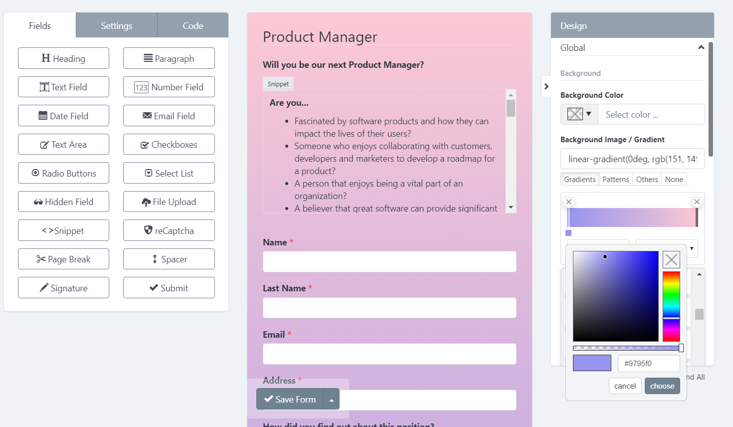
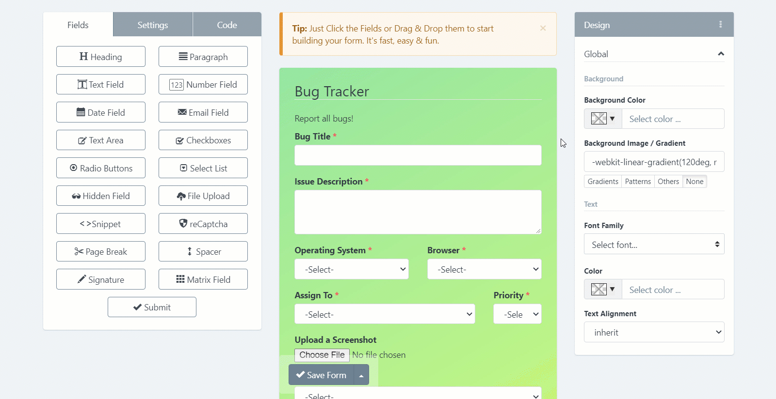
To customize the look and feel of your checklist, just go to the checklist Builder, on the right side you will see the "Design" panel. From there, set the different properties you want for your checklist design, the checklist preview area will be updated in real-time.
Design Sections 
The "Design" Panel has the following sections. Each section focuses on a checklist class that can be applied to multiple elements.
- Global: It's the checklist Container.
- Checklist: The checklist itself. By default it doesn't have a padding, to keep compatibility when a checklist widget is displayed in an external website.
- Checklist Group: Group of Label, Input, Help Text and Validation Message.
- Checklist Control: Input Field.
- Button: Submit Button (Bootstrap Primary Button).
- Label: Label Field (Bootstrap Control Label)
- Placeholder
- Heading
- Paragraph
- Help Text
- Link
- Checklist Steps: Appears when a PageBreak field has been added to the checklist.
- Checklist Alerts: Success or Error message that appears when a checklist has been submitted.
- Field Validation: To customize the error state of your fields.
- Other Components: Options for Custom Checkboxes, Custom Radio Buttons, reCAPTCHA, Signature Pad and Progress Bar are available, also.
Copy, Paste & Reset Design 
If you’ve created a checklist before, you know the process inherently includes a considerable amount of repetitive work. With the Copy Design & Paste Design features, you can copy and paste CSS styles from one checklist to another with a couple of clicks. Also, you can reset the design to the default styles with one click.
Main Tools and Features 
The Theme Designer come with useful tools to make complex designs more easy.
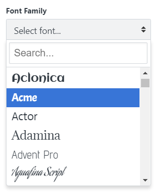
- Google Fonts Selector 
Select Google fonts with live preview from a dropdown list.
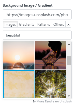
- Stock Images 
Thousands of stock images are now in the checklist Builder. With our Unsplash integration you can search and add stock images to your checklist with a couple of clicks.
You don't need to license Unsplash images. Under Unsplash’s license, you can copy, modify, download, and distribute any of their images for free, even for commercial purposes. You don’t need to ask permission from or provide attribution to the artist, but we recommend crediting them anyway.
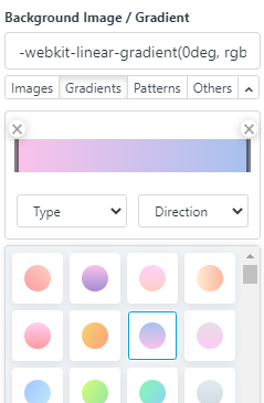
- Web Gradient Selector 
You can find the gradient selector to build your own gradient (linear, radial, choose your colors and stops and more) or choose between 100+ ready-to-use beautiful web gradients.
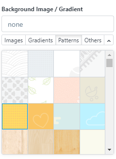
- Subtle Patterns 
Choose between several hundreds of Subtle Patterns selected to you by Toptal, beautiful textures for your checklists.
Common Uses Cases 
The Theme Designer is a flexible tool that lets you customize different parts of the checklist to generate a stylesheet. Some common use cases are:
- Hide Field Labels 
If you want to hide a field label, just click the field and enter the following Label CSS Class: sr-only
If you'd like to remove the entire checklist labels all at once, simply follow the next steps:
- In the Design panel -> Open the Label section
- Scroll down until Extra sub-section
- On Display choose None.
That's it!
Note: Never leave a field without a label, as it will help you to identify your field within the entire system.
- Align Your checklist to Center 
If you want to show your checklist on a full page (Share checklist -> Link without box) this tip will be very useful.
There are several ways to center a checklist, below we will describe the most common option:
- In the Global Section, Select Text Align: Center
- And In the checklist Section, Select:
- Text Align: Left - Margin: Auto - Width: 80%
That's all You can expand or reduce the checklist width according to your requirements.
- Design Full Width Buttons 
If you want to show a specific button with full width, just click the field and enter the following CSS Class: btn-block
But, if you'd like to design the entire checklist buttons all at once, simply follow the next steps:
- In the Design panel -> Open the Button section
- Scroll down until Size sub-section
- On Width choose 100%.
That's it!